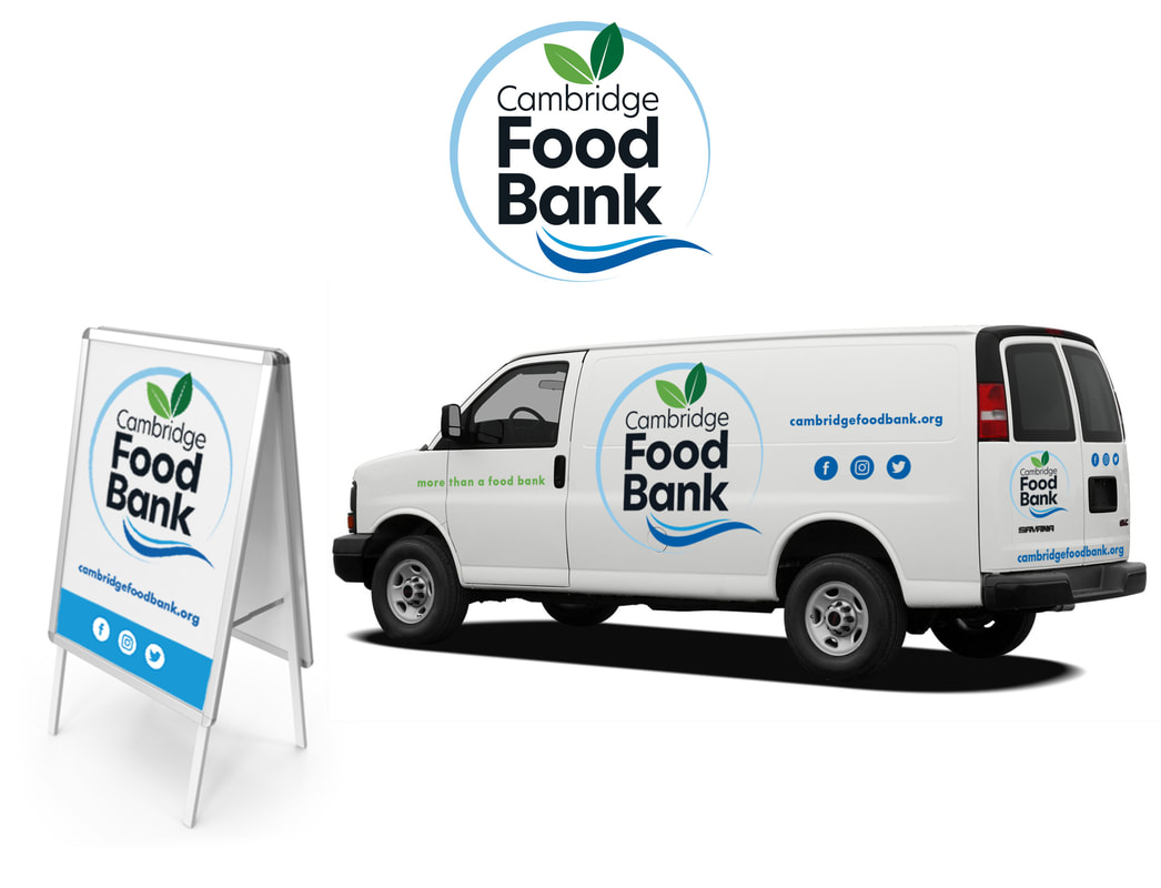
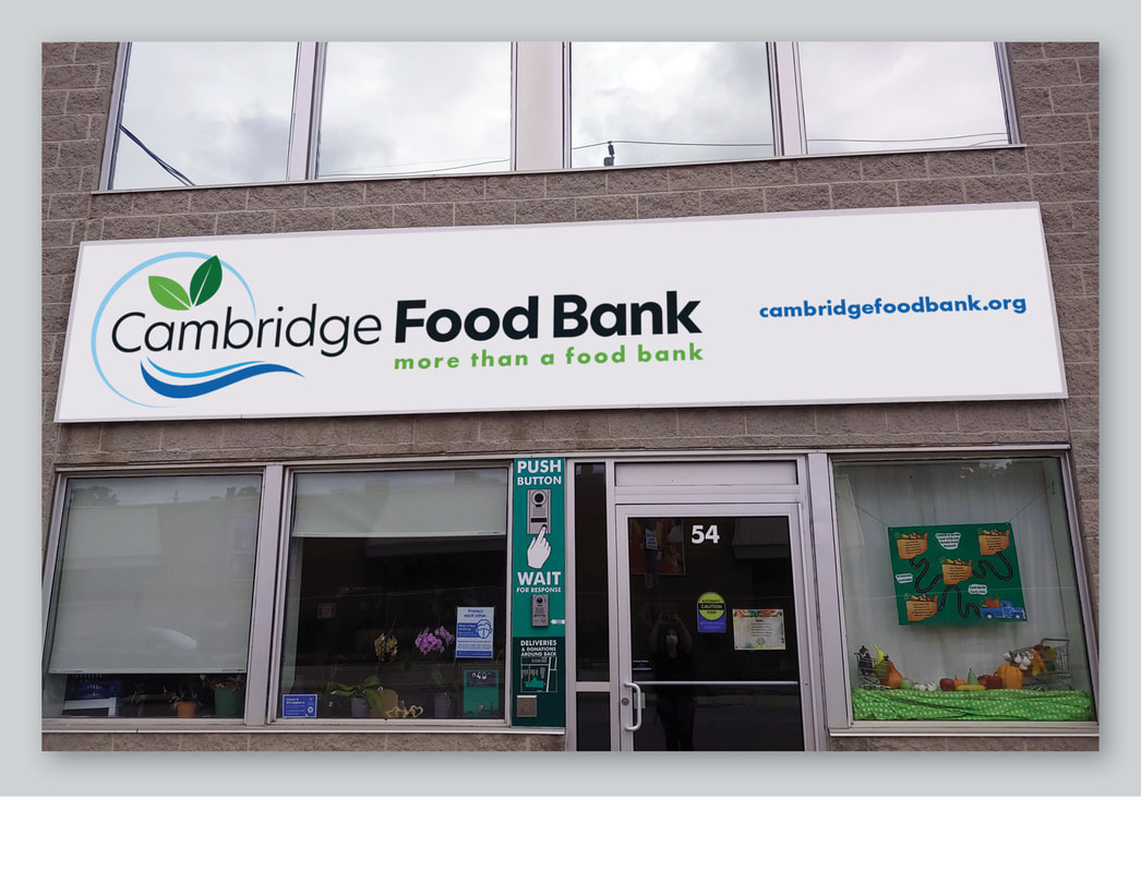
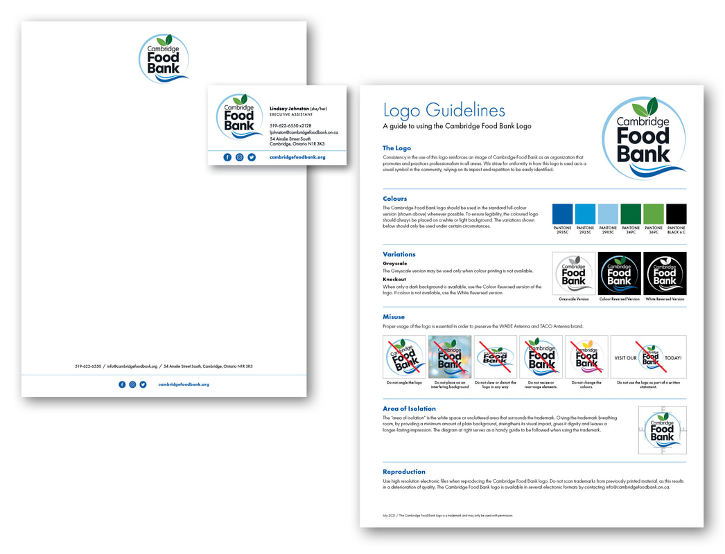
After serving the Cambridge and North Dumfries community for 35 years, it was time for the Cambridge Food Bank to refresh their vision and brand. Their original logo was much-loved and there was a desire to pay homage by retaining it’s circular shape and colour scheme. The new logo incorporates simple elements that, together, present important aspects of the agency's identity. Rather than food graphics, we are stepped back for a big-picture perspective of the agency’s mission. The leaf represents both nutrition and growth, as well as the environment. The river portrays the river of life, while giving a nod to the iconic Grand river that flows through the city of Cambridge. The circular element suggests a dinner plate, as well as a holistic understanding of the role that food pays in people’s lives. With the primary version of the logo, elements are contained within the circular element. A secondary version for horizontal layouts retains the round element, but the name itself extends beyond the circle, allowing the agency name to be more prominent. The new brand identity is currently being rolled out in promotional materials, signage, vehicles and on a new website under development.